European Sovereign Debt Crisis Redux, What's the Playbook?

I wrote this post originally  as a guest feature on RectitudeMarket.com. Check out the website for great investment ideas and original analysis.

Now that Greece has officially rejected austerity it’s time to examine our 2011 playbook to get some clues as to what might happen. More importantly depending on your timeframe there should be plenty of strategic and tactical strategies for profit due to the increase in volatility.

Let’s compare EUR/USD, Treasury yields, EU yield spreads, and other Developed Markets from 2011 to 2015 for insights on portfolio positioning.

EUR/USD Annualized Rolling Mean Returns suggest a possible structural change

Examining the chart it is easy to see that since 2014 the rolling returns have declined dramatically. In fact it is at a level only seen twice on the chart. First, in 2001 and again in 2009. Both of those periods were tail ends of global recessions. The fact that we are not in a global recession currently(yet?)  suggests potential major trend changes are continuing. 

2011 and 2015 time periods of interest are shaded gray

EUR/USD 252 day rolling volatility is spiking

Simply observing the chart the low-to-high is unparalled since 2008 although much lower on an absolute basis. This is indicative of investor indecision and whipsaws.

2011 and 2015 time periods of interest are shaded gray

Developed Markets' Rolling Mean Returns show decoupling

During periods of global financial streess the commodity countries appear to show acute weakness. EWA and EWC are seriously underperforming their developed market, non-EU peers. QQQ appears to show the most resilience in the face of Eurozone stress in both 2011, and 2015. 

2011 and 2015 time periods of interest are shaded gray

Treasury Yields are likely to fall in a flight to safety trade then continue rising

During the 2011 crisis you can see treasury yields collapse on a lagged basis before continuining to rise. It is likely that yields will follow the same playbook by compressing until more market participants feel certainty regarding potential contagion risk. Barring a total collapse in investor faith in the EU I doubt yields stay compressed for very long given what appears to be a structural shift in rates. 

2011 and 2015 time periods of interest are shaded gray

Treasury Yield volatility is rising yet remains muted when compared to 2011

All 3 maturities remain below their 2011 and subsequent 2012 peaks. They could test those highs but the chart shows a general downtrend in rolling volatility. 

2011 and 2015 time periods of interest are shaded gray

Long term lagged Eurozone interest rate spreads do not show contagion risk like 2011

Examining the long term rates pulled from the ECB’s website we can look at the yield spreads over German Bunds to get an indication of the potential contagion risk this time around. The entire year of 2011 is shaded given the bulk of the crisis happened within that time period. Compared to 2011, Italy, Spain, and Portugal are not yet seeing the same ‘stress’ in 2015. 

2011 and 2015 time periods of interest are shaded gray

Conclusions

1.       Expect increasing volatility across the board as market uncertainty heightens regarding potential contagion risk.

2.       Create your shopping list for ‘overvalued’ ETF’s and individual equities as the potential flight to safety trade will likely create reasonable longer term buying opportunities in quality names.

3.       Barring a complete debacle in the Eurozone US markets are likely to outperform other developed market peers.

4.       Pay particular attention to the EU yield spreads over ‘safe’ German Bonds. If the peripheral spreads start to blow out again as they did in 2011, all bets are off and safety of investment capital becomes critically important if it hasn’t already. 

COMPOSITE SECTOR ETF VALUATION UPDATED [5.24.2015]

Check out my updated IPython Notebook where I take a look at changes and trends in ETF valuations using the Implied Cost of Capital model. To learn more about the model and the methodology used see here and here

Composite Sector ETF Valuation updated [5.24.2015]

Composite Sector ETF Valuation updated [5.10.2015]

Check out my updated IPython Notebook where I take a look at changes and trends in ETF valuations using the Implied Cost of Capital model. To learn more about the model and the methodology used see here and here

Composite Sector ETF Valuation updated [5.10.2015]

The US Treasury Fakeout

Global bond market volatility was at a relative extreme this week. Following the markets you would see headlines like this:

The basic premise being that the world is awash in liquidity and as a result of the prices of government bonds, investment grade bonds (IG), and high yield (HY), have been bid so heavily that the yields of these instruments no longer reflect the credit and/or currency risks associated with the issues. 

Of particular interest to me was the relentless selling in USD based assets especially treasuries. 

$TYX=30 year, $TNX=10 year, $FVX=5 year, $UST2Y=2 year

As an investor the question became "Is this the beginning of a new trend or a false (counter) trend within the larger trend?". To answer questions like these I try simplify the logic. 

  1. Are the other global central banks committed to active devaluation of their currencies while the FED is not? Yes, they are. That's (USD) positive. 
  2. Do current global market conditions allow for gray (black) swan events? Yes.
  3. Given a gray (black) swan event, which markets are creditworthy as well as deep and liquid enough to absorb multiples of Billions of investor capital in a 'flight to safety' response? The U.S. government bond market is the only one to meet all the aforementioned criteria. Again (USD) positive. 
  4. Examining bond yields relative to credit/currency risk are there more attractive international government bond instruments available? No. Even with the recognized overvaluation in US bonds US gov't yields are still the most attractive relative to credit/currency risk. 

http://online.wsj.com/mdc/public/page/2_3022-govtbonds.html

Currently examining the chart only Portugal, and Australia are offering better yields than the US 10 year. Clearly risk is being artificially repriced according to central bank machinations. Keep in mind Eurozone member bonds were priced for default within the last 24 months. Now government bonds in Spain and Italy are priced as if they represent better credit risk than the US! That's pure foolishness.

As a fixed income portfolio manager you can't find a better setup.  As a result it is my belief that the previous sell-off in global bond markets represented more rotational and risk management behavior as opposed to a new trend. Again, put yourself in a fixed income PM's shoes. You have a multi-billion dollar bond portfolio to manage, your options are limited in terms of investable markets. The best credit risk in the world (USD) is yielding higher than 80% of your available options. On a relative basis you better believe there will be a bid under treasuries as long as the current capital market framework is in place. 

Examining the % change in yields of US treasuries from their Wednesday highs to Friday's close, it appears as if portfolio managers were moving to the shorter end of the curve as the 2, 5, 10 year all outperformed the 30 year. 

http://www.treasury.gov/resource-center/data-chart-center/interest-rates/Pages/TextView.aspx?data=yield

Stay Long Stocks Until...

canvas1.png

...the Fed stops buying Bonds. It's as simple as that. The Fed has committed to purchasing $45 billion in treasuries and $40 billion in MBS per month for the foreseeable future. That's a run rate of ~1 trillion a year! The "Fed put" is real and I can prove it. Look at the following chart.

US Federal Reserve Total Assets Chart

US Federal Reserve Total Assets data by YCharts

The plot starts on 11/25/2008 or the beginning of the first Quantitative Easing program (QE1). We can see there is a clear relationship between the Federal Reserve's balance sheet and the broader market (S&P 500). In fact the the correlation is ~92%. Furthermore notice that during periods where the Fed balance sheet has stabilized, the S&P experienced higher price volatility.

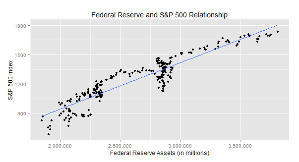
Chart number 2 plots the S&P 500 index level against the Fed asset level using data points from 11/25/2008 to present.

SP500_FedAssets

Notice the linear relationship between the two. In fact I ran a simple regression model which produced an R^2 of ~86%. That means ~86% of the variability of the S&P 500 price level is explained by the size of the Federal Reserve's balance sheet!

Simply put, if the Fed is continuing to to buy bonds and increase its balance sheet then keep buying stocks! My R code is provided below.