
Advanced Time Series Plots in Python
/POST OUTLINE
- Motivation
- Get Data
- Default Plot with Recession Shading
- Add Chart Titles, Axis Labels, Fancy Legend, Horizontal Line
- Format X and Y Axis Tick Labels
- Change Font and Add Data Markers
- Add Annotations
- Add Logo/Watermarks
MOTIVATION
Since I started this blog a few years ago, one of my obsessions is creating good looking, informative plots/charts. I've spent an inordinate amount of time learning how to do this and it is still a work in a progress. However all my work is not in vain as several of you readers have commented and messaged me for the code behind some of my time series plots. Beginning with basic time series data, I will show you how I produce these charts.
get data
Import packages
import pandas as pd
import pandas_datareader.data as web

import numpy as np
import matplotlib as mpl
import matplotlib.pyplot as plt
%matplotlib inline

import seaborn as sns
sns.set_style('white', {"xtick.major.size": 2, "ytick.major.size": 2})
flatui = ["#9b59b6", "#3498db", "#95a5a6", "#e74c3c", "#34495e", "#2ecc71","#f4cae4"]
sns.set_palette(sns.color_palette(flatui,7))

import missingno as msno
p=print

save_loc = '/YOUR/PROJECT/LOCATION/'
logo_loc = '/YOUR/WATERMARK/LOCATION/'
Get time series data from Yahoo finance and recession data from FRED.
# get index and fed data

f1 = 'USREC' # recession data from FRED

start = pd.to_datetime('1999-01-01')
end = pd.datetime.today()

mkt = '^GSPC'
MKT = (web.DataReader([mkt,'^VIX'], 'yahoo', start, end)['Adj Close']
      .resample('MS') # month start b/c FED data is month start
       .mean()
       .rename(columns={mkt:'SPX','^VIX':'VIX'})
       .assign(SPX_returns=lambda x: np.log(x['SPX']/x['SPX'].shift(1)))
       .assign(VIX_returns=lambda x: np.log(x['VIX']/x['VIX'].shift(1)))
       )

data = (web.DataReader([f1], 'fred', start, end)
        .join(MKT, how='outer')
        .dropna())

p(data.head())
p(data.info())
msno.matrix(data)
DEFAULT PLOT WITH RECESSION SHADING
Now we have to setup our recession data so we can get the official begin and end dates for each recession over the period.
# recessions are marked as 1 in the data
recs = data.query('USREC==1')

# Select the two recessions over the time period
recs_2k = recs.ix['2001']
recs_2k8 = recs.ix['2008':]

# now we can grab the indices for the start
# and end of each recession
recs2k_bgn = recs_2k.index[0]
recs2k_end = recs_2k.index[-1]

recs2k8_bgn = recs_2k8.index[0]
recs2k8_end = recs_2k8.index[-1]
Now we can plot the default chart with recession shading. Let's take a look.
# Let's plot SPX and VIX cumulative returns with recession overlay
plot_cols = ['SPX_returns', 'VIX_returns']

# 2 axes for 2 subplots

fig, axes = plt.subplots(2,1, figsize=(10,7), sharex=True)
data[plot_cols].plot(subplots=True, ax=axes)
for ax in axes:
    ax.axvspan(recs2k_bgn, recs2k_end, color=sns.xkcd_rgb['grey'], alpha=0.5)
    ax.axvspan(recs2k8_bgn, recs2k8_end,  color=sns.xkcd_rgb['grey'], alpha=0.5)
The default plot is ok but we can do better. Let's add chart titles, axis labels, spruce up the legend, and add a horizontal line for 0.
ADD CHART TITLES, AXIS LABELS, FANCY LEGEND, HORIZONTAL LINE
fig, axes = plt.subplots(2,1, figsize=(10,7), sharex=True)
data[plot_cols].plot(subplots=True, ax=axes)

# for subplots we must add features by subplot axis
for ax, col in zip(axes, plot_cols):
    ax.axvspan(recs2k_bgn, recs2k_end, color=sns.xkcd_rgb['grey'], alpha=0.5)
    ax.axvspan(recs2k8_bgn, recs2k8_end,  color=sns.xkcd_rgb['grey'], alpha=0.5)

    # lets add horizontal zero lines
    ax.axhline(0, color='k', linestyle='-', linewidth=1)

    # add titles
    ax.set_title('Monthly ' + col + ' \nRecessions Shaded Gray')

    # add axis labels
    ax.set_ylabel('Returns')
    ax.set_xlabel('Date')

    # add cool legend
    ax.legend(loc='upper left', fontsize=11, frameon=True).get_frame().set_edgecolor('blue')

# now to use tight layout
plt.tight_layout()
This is a step up but still not good enough. I prefer more informative dates on the x-axis, and percent formatting on the y-axis.
Format X and Y axis tick labels
# better but I prefer more advanced axis tick labels

fig, axes = plt.subplots(2,1, figsize=(12,9), sharex=True)
data[plot_cols].plot(subplots=True, ax=axes)

# for subplots we must add features by subplot axis
for ax, col in zip(axes, plot_cols):
    ax.axvspan(recs2k_bgn, recs2k_end, color=sns.xkcd_rgb['grey'], alpha=0.5)
    ax.axvspan(recs2k8_bgn, recs2k8_end,  color=sns.xkcd_rgb['grey'], alpha=0.5)

    # lets add horizontal zero lines
    ax.axhline(0, color='k', linestyle='-', linewidth=1)

    # add titles
    ax.set_title('Monthly ' + col + ' \nRecessions Shaded Gray')

    # add axis labels
    ax.set_ylabel('Returns')
    ax.set_xlabel('Date')

    # upgrade axis tick labels
    yticks = ax.get_yticks()
    ax.set_yticklabels(['{:3.1f}%'.format(x*100) for x in yticks]);

    dates_rng = pd.date_range(data.index[0], data.index[-1], freq='6M')
    plt.xticks(dates_rng, [dtz.strftime('%Y-%m') for dtz in dates_rng], rotation=45)

    # add cool legend
    ax.legend(loc='upper left', fontsize=11, frameon=True).get_frame().set_edgecolor('blue')

# now to use tight layout
plt.tight_layout()
It's an improvement, but I hate Arial font, and would like to add data point markers.
change font and add data markers
# I want markers for the data points, and change to font

mpl.rcParams['font.family'] = 'Ubuntu Mono'
fig, axes = plt.subplots(2,1, figsize=(10,7), sharex=True)
data[plot_cols].plot(subplots=True, ax=axes, marker='o', ms=3)

# for subplots we must add features by subplot axis
for ax, col in zip(axes, plot_cols):
    ax.axvspan(recs2k_bgn, recs2k_end, color=sns.xkcd_rgb['grey'], alpha=0.5)
    ax.axvspan(recs2k8_bgn, recs2k8_end,  color=sns.xkcd_rgb['grey'], alpha=0.5)

    # lets add horizontal zero lines
    ax.axhline(0, color='k', linestyle='-', linewidth=1)

    # add titles
    ax.set_title('Monthly ' + col + ' \nRecessions Shaded Gray')

    # add axis labels
    ax.set_ylabel('Returns')
    ax.set_xlabel('Date')

    # upgrade axis tick labels
    yticks = ax.get_yticks()
    ax.set_yticklabels(['{:3.2f}%'.format(x*100) for x in yticks]);

    dates_rng = pd.date_range(data.index[0], data.index[-1], freq='6M')
    plt.xticks(dates_rng, [dtz.strftime('%Y-%m') for dtz in dates_rng], rotation=45)

    # add cool legend
    ax.legend(loc='upper left', fontsize=11, frameon=True).get_frame().set_edgecolor('blue')

# now to use tight layout
plt.tight_layout()
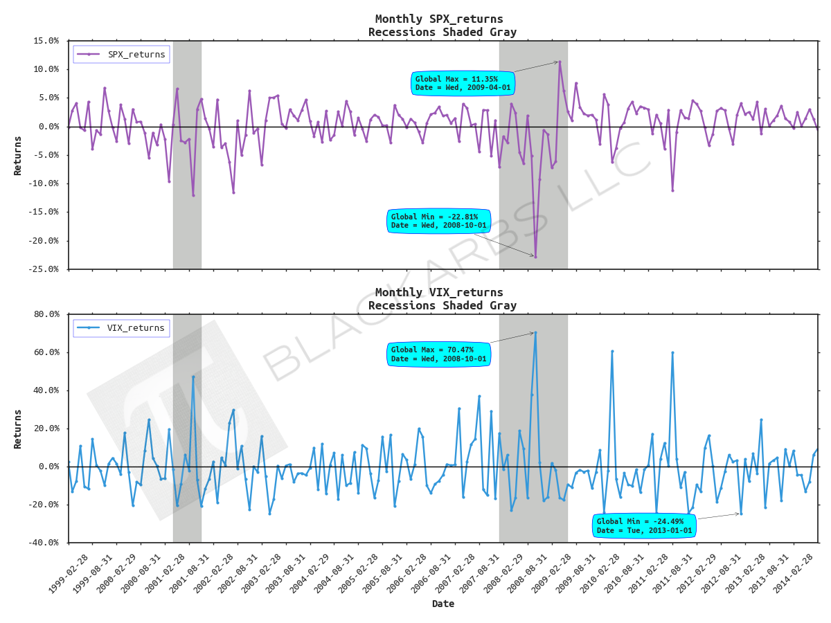
It's starting to look pretty good, but we can get even more fancy. Say we wanted to annotate the global maximum and minimum returns in each subplot along with their respective dates for SPX and VIX . That could be a challenge. To do this we first need to extract the max/mins and idxmax/idxmin for both series.
add chart annotations
# I want to know show the global max and mins and their dates

# --------------------------------------------------------------- #
# MAX SPX Returns
spx_max_ = data[plot_cols[0]].max()
spx_max_idx_ = data[plot_cols[0]].idxmax(axis=0, skipna=True)

# MIN SPX Returns
spx_min_ = data[plot_cols[0]].min()
spx_min_idx_ = data[plot_cols[0]].idxmin(axis=0, skipna=True)

# MAX VIX Returns
vix_max_ = data[plot_cols[1]].max()
vix_max_idx_ = data[plot_cols[1]].idxmax(axis=0, skipna=True)

# MIN VIX Returns
vix_min_ = data[plot_cols[1]].min()
vix_min_idx_ = data[plot_cols[1]].idxmin(axis=0, skipna=True)
Now that we have this information we can get clever with the annotation tools Matplotlib provides. Also, I want to touch up some of the axis labels and axis tick labels as well.
mpl.rcParams['font.family'] = 'Ubuntu Mono'
fig, axes = plt.subplots(2,1, figsize=(12,9), sharex=True)
data[plot_cols].plot(subplots=True, ax=axes, marker='o', ms=3)

# for subplots we must add features by subplot axis
for ax, col in zip(axes, plot_cols):
    ax.axvspan(recs2k_bgn, recs2k_end, color=sns.xkcd_rgb['grey'], alpha=0.5)
    ax.axvspan(recs2k8_bgn, recs2k8_end,  color=sns.xkcd_rgb['grey'], alpha=0.5)

    # lets add horizontal zero lines
    ax.axhline(0, color='k', linestyle='-', linewidth=1)

    # add titles
    ax.set_title('Monthly ' + col + ' \nRecessions Shaded Gray', fontsize=14, fontweight='demi')

    # add axis labels
    ax.set_ylabel('Returns', fontsize=12, fontweight='demi')
    ax.set_xlabel('Date', fontsize=12, fontweight='demi')

    # upgrade axis tick labels
    yticks = ax.get_yticks()
    ax.set_yticklabels(['{:3.1f}%'.format(x*100) for x in yticks]);

    dates_rng = pd.date_range(data.index[0], data.index[-1], freq='6M')
    plt.xticks(dates_rng, [dtz.strftime('%Y-%m-%d') for dtz in dates_rng], rotation=45)

    # bold up tick axes
    ax.tick_params(axis='both', which='major', labelsize=11)

    # add cool legend
    ax.legend(loc='upper left', fontsize=11, frameon=True).get_frame().set_edgecolor('blue')

# add global max/min annotations
# add cool annotation box
bbox_props = dict(boxstyle="round4, pad=0.6", fc="cyan", ec="b", lw=.5)

axes[0].annotate('Global Max = {:.2%}\nDate = {}'
                 .format(spx_max_, spx_max_idx_.strftime('%a, %Y-%m-%d')),
            fontsize=9,
            fontweight='bold',
            xy=(spx_max_idx_, spx_max_),
            xycoords='data',
            xytext=(-150, -30),
            textcoords='offset points',
            arrowprops=dict(arrowstyle="->"), bbox=bbox_props)

axes[0].annotate('Global Min = {:.2%}\nDate = {}'
                 .format(spx_min_, spx_min_idx_.strftime('%a, %Y-%m-%d')),
            fontsize=9,
            fontweight='demi',
            xy=(spx_min_idx_, spx_min_),
            xycoords='data',
            xytext=(-150, 30),
            textcoords='offset points',
            arrowprops=dict(arrowstyle="->"), bbox=bbox_props)

axes[1].annotate('Global Max = {:.2%}\nDate = {}'
                 .format(vix_max_, vix_max_idx_.strftime('%a, %Y-%m-%d')),
            fontsize=9,
            fontweight='bold',
            xy=(vix_max_idx_, vix_max_),
            xycoords='data',
            xytext=(-150, -30),
            textcoords='offset points',
            arrowprops=dict(arrowstyle="->"), bbox=bbox_props)

axes[1].annotate('Global Min = {:.2%}\nDate = {}'
                 .format(vix_min_, vix_min_idx_.strftime('%a, %Y-%m-%d')),
            fontsize=9,
            fontweight='demi',
            xy=(vix_min_idx_, vix_min_),
            xycoords='data',
            xytext=(-150, -20),
            textcoords='offset points',
            arrowprops=dict(arrowstyle="->"), bbox=bbox_props)

# now to use tight layout
plt.tight_layout()
Wow, now it's looking really good. But what if you wanted to insert branding via a watermark? That's simple, add the following line of code before the plt.tight_layout() line and voila.
add logo/watermark
# add logo watermark
im = mpl.image.imread(logo_loc)
axes[0].figure.figimage(im, origin='upper', alpha=0.125, zorder=10)