

Exploring Our Scraped Options Data Bid-Ask Spreads (Part-2)
/Post Outline
- Notes on Part-2
- The Data
- Bid-Ask Spread Analysis
- How Do Aggregate Bid-Ask Spreads Vary with Days To Expiration?
- How Do Bid-Ask Spreads Vary with Volume?
- How Do Bid-Ask Spreads Vary with Volatility?
- Summary Conclusions
Notes on Part-2
Some astute readers in the comments noted that analysis based on the absolute difference in bid-ask price is not robust when considering the price of the underlying option and can lead to spurious conclusions. They recommended defining bid-ask spread as a percent of the option's spot price.
Additionally, I failed to constrain the analysis to include only options with a certain level of "moneyness". That is, options far away from the strike price behave differently than options that are closer, and the prior analysis failed to incorporate that understanding. In Part 2 of this exploration we re-examine the conclusions drawn in Part-1, after incorporating the aforementioned suggestions. With that said, this post will largely follow the format of Part-1, so if you feel you are missing context for this analysis start there.
The Data
The data is a cleaned hdf5/.h5 file comprised of a collection of daily options data collected over the period of 05/17/2017 to 07/24/2017. By cleaned I mean I aggregated the daily data into one set, removed some unnecessary columns, cleaned up the data types and added the underlying ETF prices from Yahoo. I make no claims about the accuracy of the data itself, and I present it as is. It is approximately a 1 GB in size and I have made it available for download at the following link:
Options Data
To import the data into your python environment:
import pandas as pd; data = pd.read_hdf('option_data_2017-05-17_to_2017-07-24.h5', key='data')
%load_ext watermark
%watermark
import sys
import os

import pandas as pd
pd.options.display.float_format = '{:,.4f}'.format
import numpy as np
import scipy.stats as stats
import pymc3 as pm

from mpl_toolkits import mplot3d
import matplotlib as mpl
import matplotlib.pyplot as plt
%matplotlib inline
plt.style.use('seaborn-muted')

import plotnine as pn
import mizani.breaks as mzb
import mizani.formatters as mzf

import seaborn as sns
from tqdm import tqdm
import warnings
warnings.filterwarnings("ignore")

p=print
p()
%watermark -p pymc3,pandas,pandas_datareader,numpy,scipy,matplotlib,seaborn,plotnine
# convenience functions

# add spread as percentage of spot
def create_spread_percent(df):
    return (df.assign(spread_pct = lambda df: df.spread / df.askPrice))

# add instrinsic values
def create_intrinsic(df):
    # create intrinsic value column
    call_intrinsic = df.query('optionType == "Call"').loc[:, 'underlyingPrice']\
     - df.query('optionType == "Call"').loc[:, 'strikePrice']
    put_intrinsic = df.query('optionType == "Put"').loc[:, 'strikePrice']\
     - df.query('optionType == "Put"').loc[:, 'underlyingPrice']

    df['intrinsic_value'] = [np.nan] * df.shape[0]
    (df.loc[df['optionType'] == "Call", ['intrinsic_value']]) = call_intrinsic
    (df.loc[df['optionType'] == "Put", ['intrinsic_value']]) = put_intrinsic
    return df

# fn: code adapted from https://github.com/jonsedar/pymc3_vs_pystan/blob/master/convenience_functions.py
def custom_describe(df, nidx=3, nfeats=20):
    ''' Concat transposed topN rows, numerical desc & dtypes '''

    print(df.shape)
    nrows = df.shape[0]

    rndidx = np.random.randint(0,len(df),nidx)
    dfdesc = df.describe().T

    for col in ['mean','std']:
        dfdesc[col] = dfdesc[col].apply(lambda x: np.round(x,2))

    dfout = pd.concat((df.iloc[rndidx].T, dfdesc, df.dtypes), axis=1, join='outer')
    dfout = dfout.loc[df.columns.values]
    dfout.rename(columns={0:'dtype'}, inplace=True)

    # add count nonNAN, min, max for string cols
    nan_sum = df.isnull().sum()
    dfout['count'] = nrows - nan_sum
    dfout['min'] = df.min().apply(lambda x: x[:6] if type(x) == str else x)
    dfout['max'] = df.max().apply(lambda x: x[:6] if type(x) == str else x)
    dfout['nunique'] = df.apply(pd.Series.nunique)
    dfout['nan_count'] = nan_sum
    dfout['pct_nan'] = nan_sum / nrows

    return dfout.iloc[:nfeats, :]
%%time

op_data = (pd.read_hdf('option_data_2017-05-17_to_2017-07-24.h5', key='data')
           .dropna(subset=['underlyingPrice', 'spread', 'askPrice'])
           .pipe(create_spread_percent)
           .pipe(create_intrinsic)
           .reset_index(drop=True))

### filter by moneyness

# within 20% of strike in either direction
def filter_by_moneyness(df, pct_cutoff=0.2):
    crit1 = (1-pct_cutoff)*df.strikePrice < df.underlyingPrice
    crit2 = df.underlyingPrice < (1+pct_cutoff)*df.strikePrice
    return (df.loc[crit1 & crit2].reset_index(drop=True))

data = filter_by_moneyness(op_data)

data_describe = custom_describe(data)
data_describe
Bid-Ask Spread Analysis
HOW DO AGGREGATE BID-ASK SPREADS VARY WITH DAYS TO EXPIRATION?
sprd_by_dtm = (data.groupby(['symbol', 'daysToExpiration', 'optionType'],
                            as_index=False)['spread_pct'].median()
               .groupby(['daysToExpiration', 'optionType'], as_index=False).median()
               .assign(bins = lambda x: pd.qcut(x.daysToExpiration, 10, labels=False)))
sprd_by_dtm.sample(5)
def plot_spread_dtm(sprd_by_dtm):
    """
    given df plot scatter with regression line

    # Params
        df: pd.DataFrame()
    # Returns
        g: plotnine figure
    """
    g = (pn.ggplot(sprd_by_dtm, pn.aes('daysToExpiration', 'spread_pct', color='factor(bins)'))
         + pn.geom_point(pn.aes(shape='factor(bins)'))
         + pn.stat_smooth(method='glm')
         + pn.scale_y_continuous(breaks=mzb.mpl_breaks(),
                                 labels=mzf.percent_format(),
                                 limits=(0, sprd_by_dtm.spread_pct.max()))
         + pn.scale_x_continuous(breaks=range(0, sprd_by_dtm.daysToExpiration.max(), 50),
                                              limits=(0, sprd_by_dtm.daysToExpiration.max()))
         + pn.theme_linedraw()
         + pn.theme(figure_size=(12,6), panel_background=pn.element_rect(fill='black'),
                    axis_text_x=pn.element_text(rotation=50),)
         + pn.ylab('bid-ask spread')
         + pn.ggtitle('Option Spread by DTM'))
    return g

# ------------------------------
# Example use of func for both calls and puts

g = plot_spread_dtm(sprd_by_dtm)
g.save(filename='call-put option bid-ask spreads - daysToExpiration scatter plot-PERCENT.png')
g.draw();
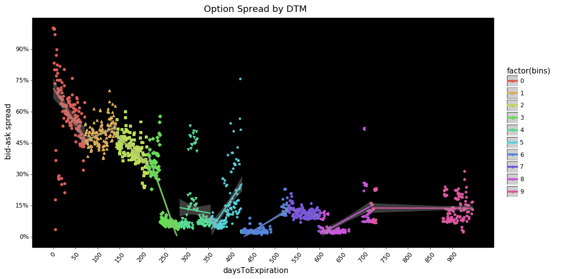
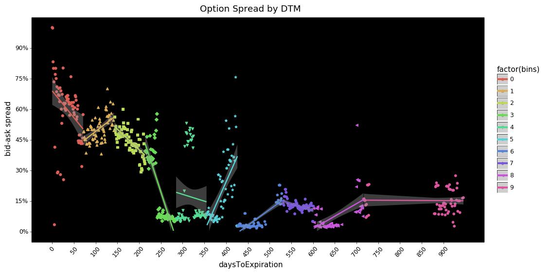
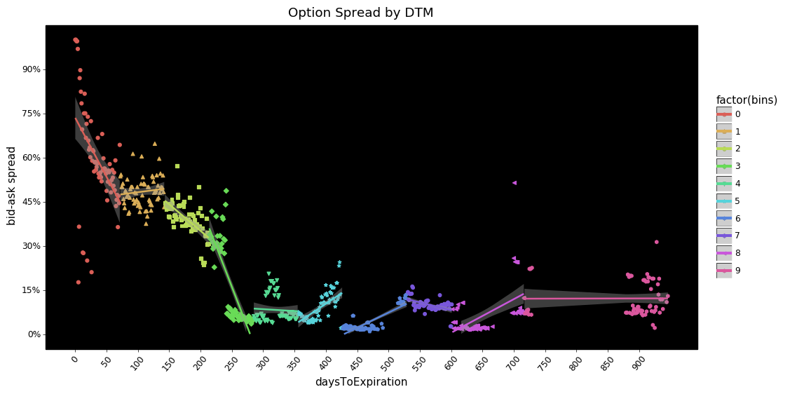
What jumps out at me is how large the spread is as a percentage of the option's ask price as you move closer to expiration. From ~220 days and below (or bin 4.5+) the pattern appears to show a a significant increase in spreads. With days to expiration longer than ~220 both calls and puts show a flattening.
My first guess as to what could cause this pattern is that, as the contract expiration approaches, the probability of being ITM is low for a vast majority of contracts. As a result the demand from market participants dries up so the cost to the market maker increases and to compensate spreads widen. I welcome any insight readers may have on this.
HOW DO BID-ASK SPREADS VARY WITH VOLUME?
median_sprd = data.groupby(['symbol', 'daysToExpiration', 'optionType'],
                           as_index=False)['spread_pct'].median()

test_syms = ['SPY', 'DIA', 'QQQ', 'TLT', 'GLD', 'USO', 'SLV', 'XLF']
sel_med_sprd = median_sprd.query('symbol in @test_syms').dropna(subset=['spread_pct'])
# to plot symbols have to cast to type str
sel_med_sprd.symbol = sel_med_sprd.symbol.astype(str)
p(sel_med_sprd.head())
p()
p(sel_med_sprd.info())
def plot_boxplot(df, x, y, optionType='Call'):
    """given df plot boxplot

    # Params
        df: pd.DataFrame()
        x: str(), column
        y: str(), column
        optionType: str()
    # Returns
        g: plotnine figure
    """

    df = df.query('optionType == @optionType')
    g = (pn.ggplot(df, pn.aes(x, y, color=f'factor({x})'))
         + pn.geom_boxplot()
         + pn.scale_y_continuous(breaks=mzb.minor_breaks(10),
                                 labels=mzf.percent_format(),
                                 limits=(0., 1.))
         + pn.theme_linedraw()
         + pn.theme(figure_size=(12,6), panel_background=pn.element_rect(fill='black'))
         + pn.ylab('bid-ask spread')
         + pn.ggtitle(f'Selected Symbol {optionType} Option Spreads'))
    return g

# ------------------------------
# example of box plot function

g = plot_boxplot(sel_med_sprd, 'symbol', 'spread_pct')
g.save(filename='call-option bid-ask spreads - boxplot-PERCENT.png')
g.draw();
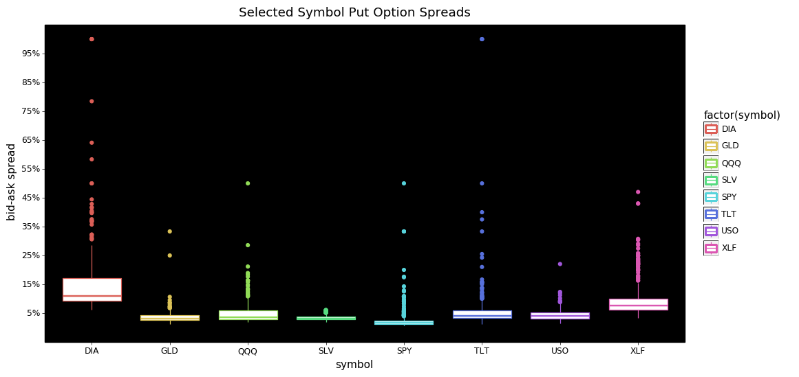
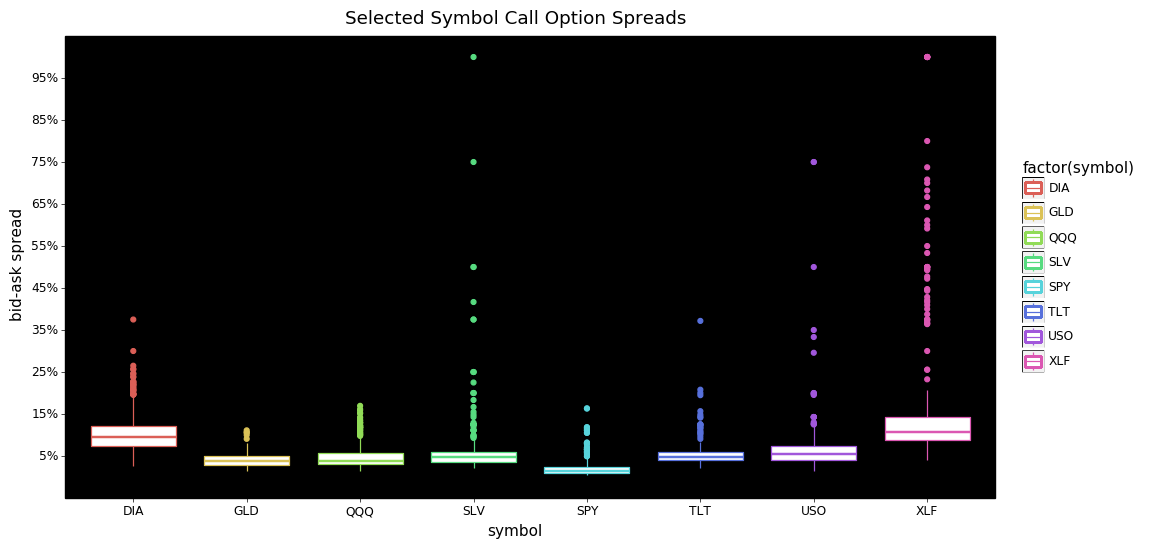
From these two plots we can see that the bulk of the bid-ask spreads are below 15% for both calls and puts. I find it interesting that for calls SLV, and XLF have more extreme tails than the others. DIA and XLF calls also appear to be priced consistently higher than the other symbols.
Looking at the put options we see DIA is more expensive with more extreme values than any other symbol. The tails for SPY, TLT, QQQ, and GLD are more extreme/dispersed than their call option counterparts.
grp_cols = ['symbol', 'daysToExpiration', 'optionType']
agg_cols = ['spread_pct', 'openInterest', 'volume', 'volatility', 'intrinsic_value']
median_sprd = data.groupby(grp_cols, as_index=False)[agg_cols].median()

test_syms = ['SPY', 'DIA', 'QQQ', 'TLT', 'GLD', 'USO', 'SLV', 'XLF']
sel_med_sprd = (median_sprd.query('symbol in @test_syms')
                .dropna(subset=['spread_pct', 'openInterest']))

# to plot symbols have to cast to type str
sel_med_sprd.symbol = sel_med_sprd.symbol.astype(str)
p(sel_med_sprd.head())
p()
p(sel_med_sprd.info())
def plot_log_points(df, x, y, color='factor(symbol)', size='openInterest'):
    g = (pn.ggplot(df, pn.aes(x, y, color=color))
         + pn.geom_point(pn.aes(size=size, shape='factor(symbol)'), alpha=0.75, stroke=.75)
         + pn.geom_hline(yintercept=pm.hpd(df[y]), size=2, color='red')
         + pn.scale_x_log10(breaks=[0,0.5,1,10,100,250,500,750,1_000])
         + pn.theme_linedraw()
         + pn.theme(figure_size=(12,6), panel_background=pn.element_rect(fill='black'),
                    axis_text_x=pn.element_text(rotation=50))
         + pn.scale_y_continuous(breaks=mzb.minor_breaks(10),
                                 labels=mzf.percent_format(),
                                 limits=(0., 1.))
         + pn.ylab('bid-ask spread'))
    return g

# ------------------------------
df = sel_med_sprd.copy()

# example with both call and puts
g = plot_log_points(df, x='volume', y='spread_pct')
g.save(filename='call-put option bid-ask spreads - volume scatter plot-PERCENT.png')
g.draw();
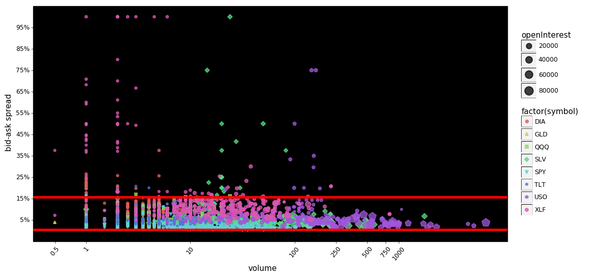
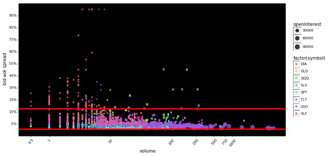
The red lines indicate the 95% interval for the data. We can see that the two plots are very similar except for minor cosmetic differences. Looking at the puts It still appears that, as volume increases the spreads are compressed a bit more than the calls even though the 95% intervals are nearly identical. Looking at the calls, there appears to be more extreme values at lower volumes than the puts.
Furthermore it appears that in this admittedly small sampling, spreads decline as open-interest and volume increase. This should not be surprising to readers, but it is noteworthy. The hypothesized mechanism for this is simple, as volume/open-interest increase, it becomes less risky for market-makers to provide their services, thus lowering the overall cost to trade.
The following two plots make this point a little bit clearer...
def facet_plot_log_points(df, x, y, color='factor(symbol)', size='openInterest'):
    g = (pn.ggplot(df, pn.aes(x, y, color=color))
         + pn.geom_point(pn.aes(size=size, shape='factor(symbol)'), alpha=0.75, stroke=.75)
         + pn.stat_smooth(method='loess')
         + pn.scale_x_log10(breaks=[0,0.5,1,10,100,250,500,750,1_000])
         + pn.theme_linedraw()
         + pn.theme(figure_size=(12,6), panel_background=pn.element_rect(fill='black'),
                    axis_text_x=pn.element_text(rotation=50))
         + pn.scale_y_continuous(breaks=mzb.minor_breaks(5),
                                 labels=mzf.percent_format(),
                                 limits=(0., 1.))
         + pn.facet_wrap('~symbol', ncol=2)
         + pn.ylab('bid-ask spread'))
    return g

# ------------------------------
# example use

g = facet_plot_log_points(df.query('optionType=="Call"'), x='volume', y='spread_pct')
g.save(filename='FACET-call option bid-ask spreads - volume scatter plot-PERCENT.png')
g.draw();
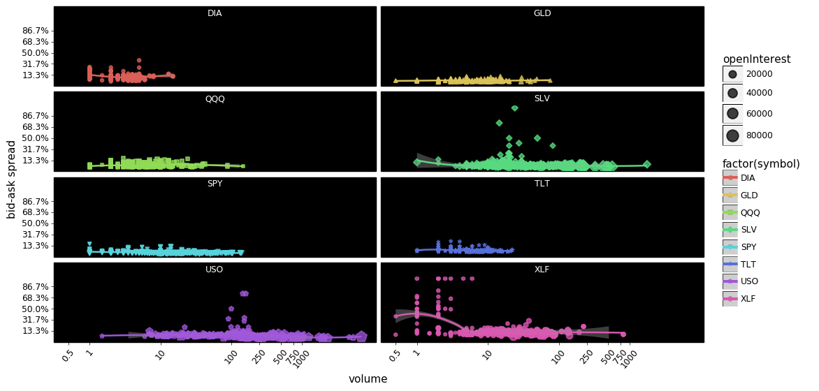
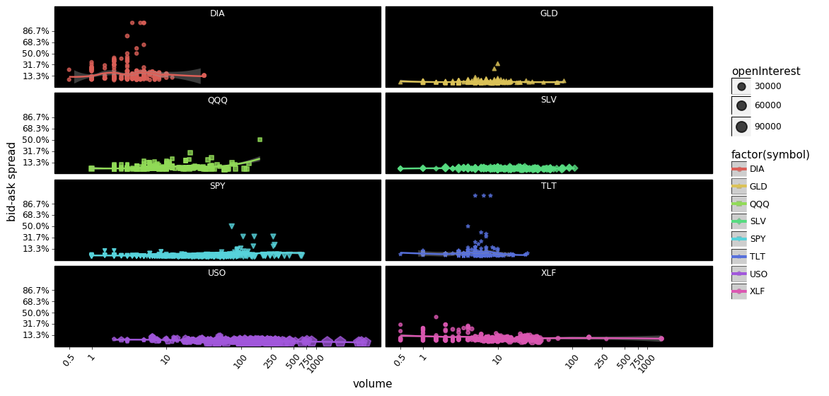
You could argue that the above plots show that market makers overall are pretty good at keeping spreads low regardless of the volume.
Also notice how much volume/open-interest there is in USO; both calls and puts are traded at a sharply higher volume than the other symbols. Next closest appears to be SLV, with XLF having some very popular contracts functioning as outliers. DIA and TLT appear to be least traded however DIA appears to be priced most inefficiently compared to the other symbols.
HOW DO BID-ASK SPREADS VARY WITH VOLATILITY?
def facet_plot_points(df, x, y, color='factor(symbol)', size='openInterest'):
    g = (pn.ggplot(df, pn.aes(x, y, color=color))
         + pn.geom_point(pn.aes(size=size, shape='factor(symbol)'), alpha=0.75, stroke=.75)
         + pn.stat_smooth(method='loess')
         + pn.theme_linedraw()
         + pn.theme(figure_size=(12,6), panel_background=pn.element_rect(fill='black'),
                    axis_text_x=pn.element_text(rotation=50))
         + pn.scale_y_continuous(breaks=mzb.minor_breaks(5),
                                 labels=mzf.percent_format(),
                                 limits=(0., 1.))
         + pn.facet_wrap('~symbol', ncol=2)
         + pn.ylab('bid-ask spread'))
    return g

# ------------------------------
# example use

g = facet_plot_points(df, 'volatility', 'spread_pct')
g.save(filename='FACET-call-put option bid-ask spreads - volatility scatter plot.png')
g.draw();
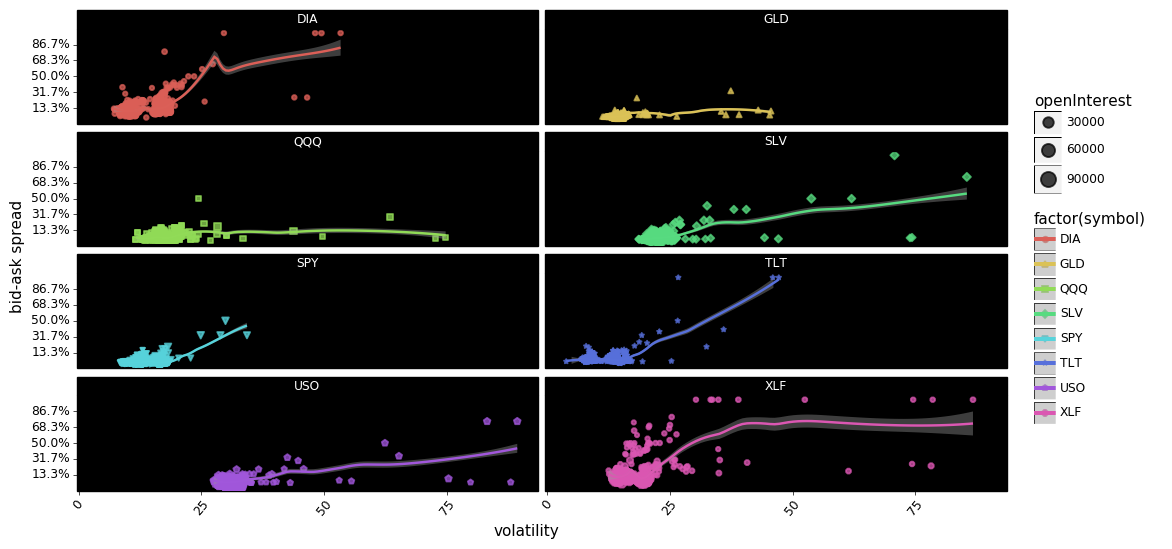
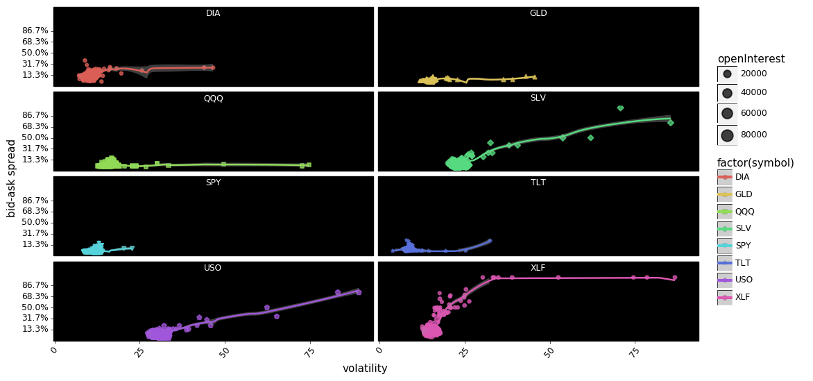
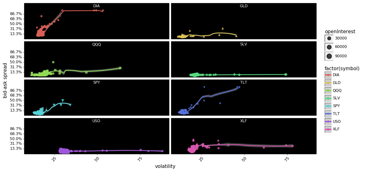
In aggregate it appears that there is some relationship between volatility and spreads, with DIA, SPY, USO, SLV, TLT, and XLF showing increases in spreads co-occurring with increases in volatility. However, the relationship looks more tenuous when we disaggregate the options into calls and puts. For example USO calls appear to show a relationship between spreads and volatility quite clearly, but USO puts show no relationship at all. The same can be said about SLV, and XLF.
Summary Conclusions
- Spreads increase dramatically as the contract nears expiration. The exact cause of this is only speculative and worthy of more investigation.
- Examining selected symbols, it appears that most of the contracts are priced competitively with each other with DIA and XLF showing the most extreme outliers.
- USO options have high interest from market participants as both calls and puts are traded at a higher volume.
- The sample size is too small to conclude anything about volatility and spreads. This relationship needs to be researched further, as common wisdom suggests spreads get wider as volatility increases. Is that true in aggregate, for calls or puts? Is that relationship stronger intraday? Would it even show up in daily or weekly samplings?
