
Using Implied Volatility to Predict Equity/ETF Returns
/During a discussion with an knowledgeable options trader, I was told the significance of interpreting the "Implied Volatility Skew" for stocks and given a paper to read for homework. To get a basic understanding of Implied Volatility Skew see this link here.
The paper I was told to read was "What Does Individual Option Volatility Smirk Tell Us About Future Equity Returns?" by Yuhang Xing, Xiaoyan Zhang and Rui Zhao. In their paper they show empirically, using their SKEW measure, allowed one to predict future stock returns between 1-4 weeks out. Furthermore they also show that a long-short portfolio based on their SKEW measure can generate alphas of 10+% annualized. This their SKEW measure:
Source: What Does Individual Option Volatility Smirk Tell Us About Future Equity Returns?
This idea was very intriguing. Using the Python/Pandas/Yahoo Finance API, I downloaded all the available options data for SPY holdings, and for a selected group of ETF's.
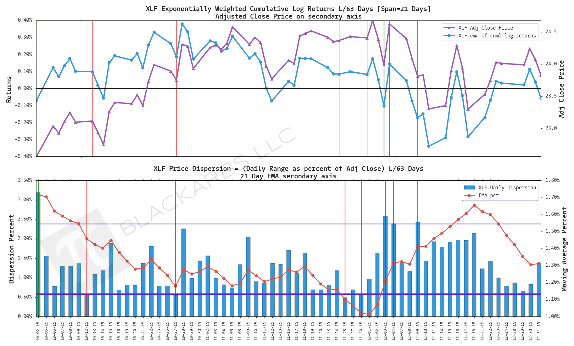
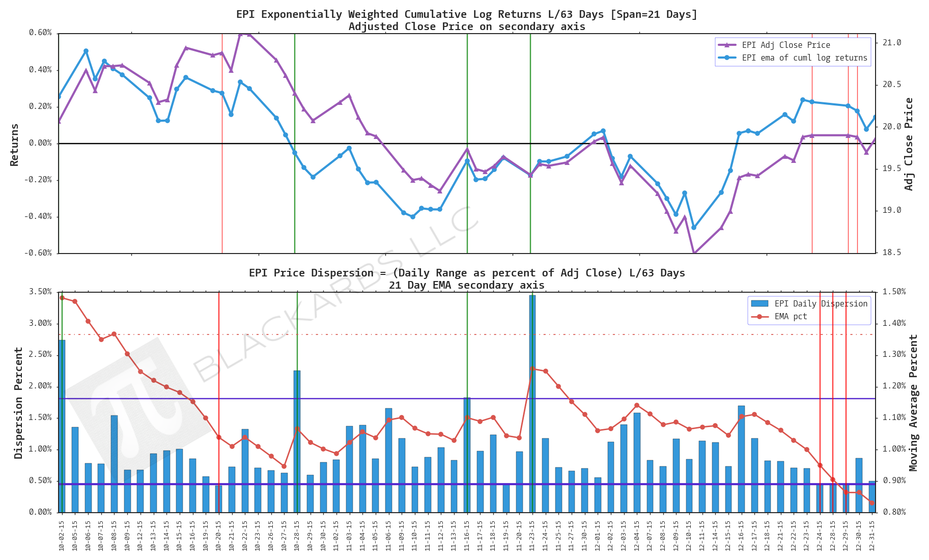
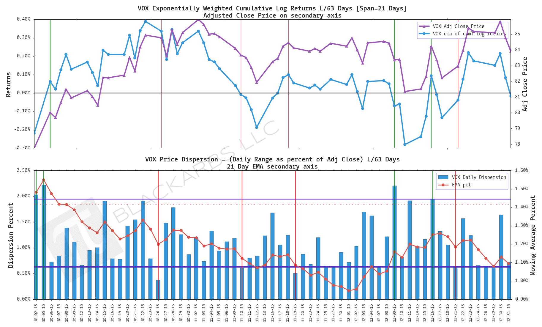
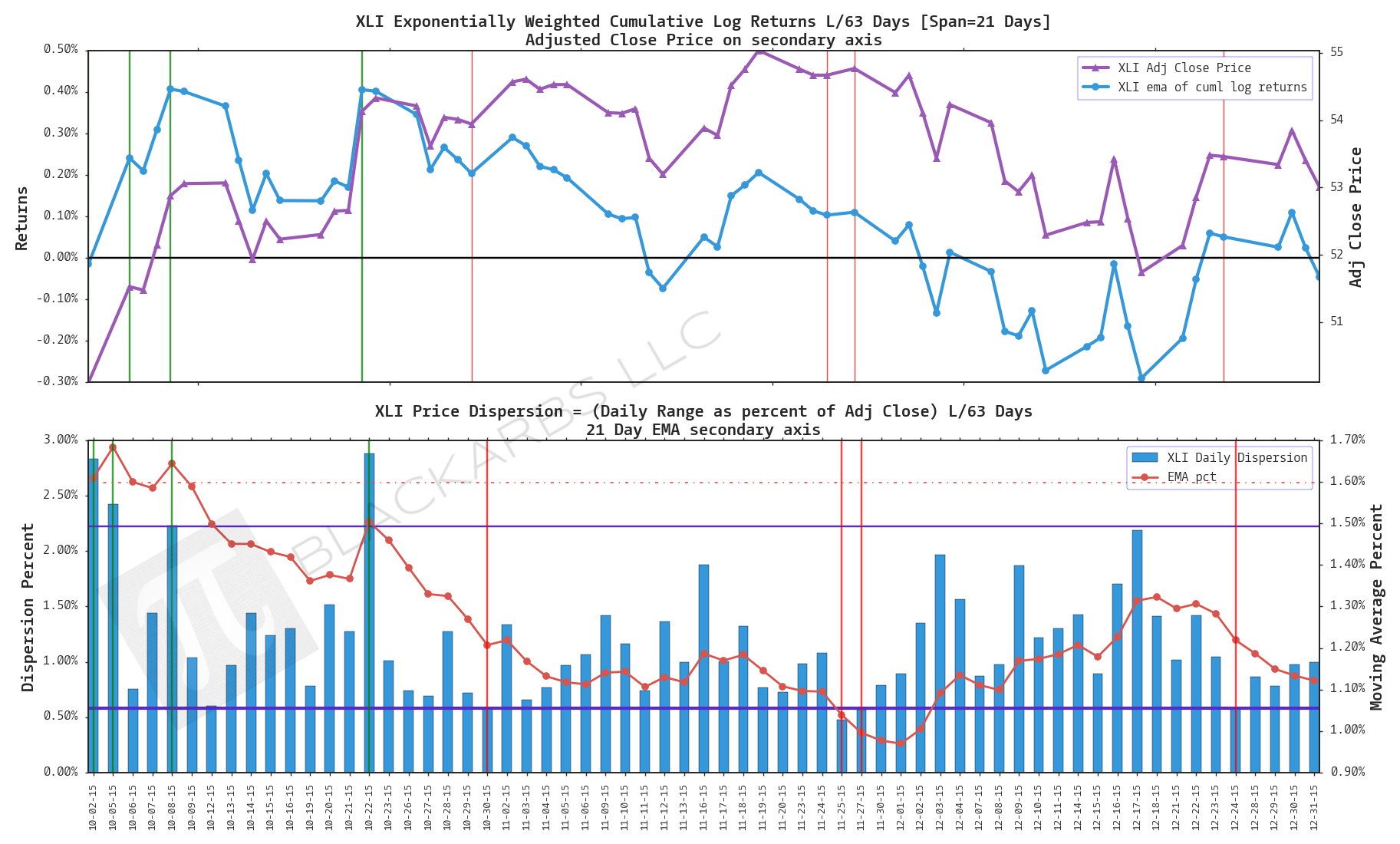
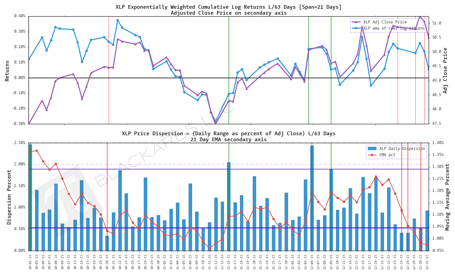
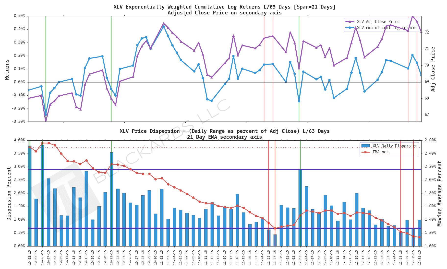
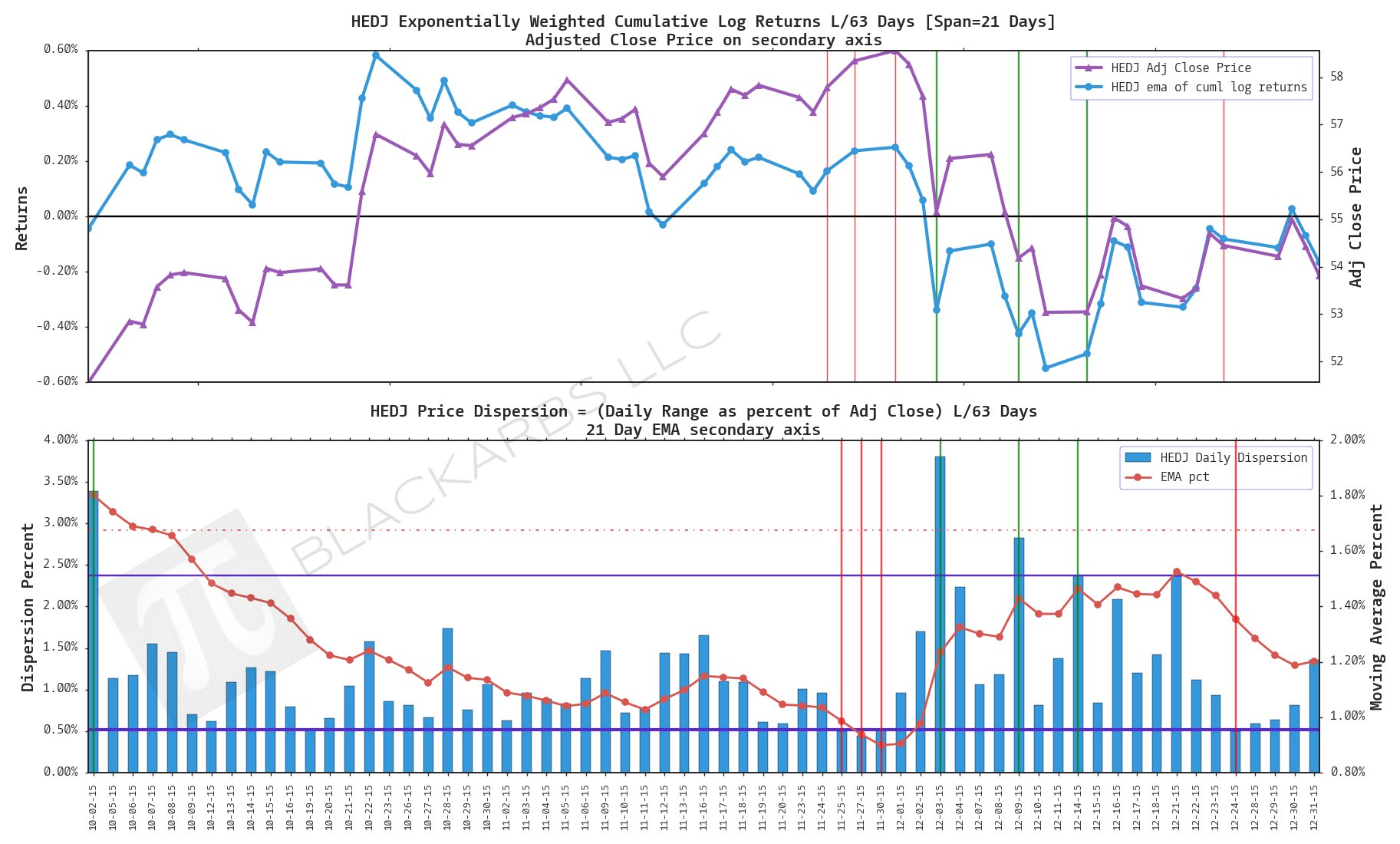
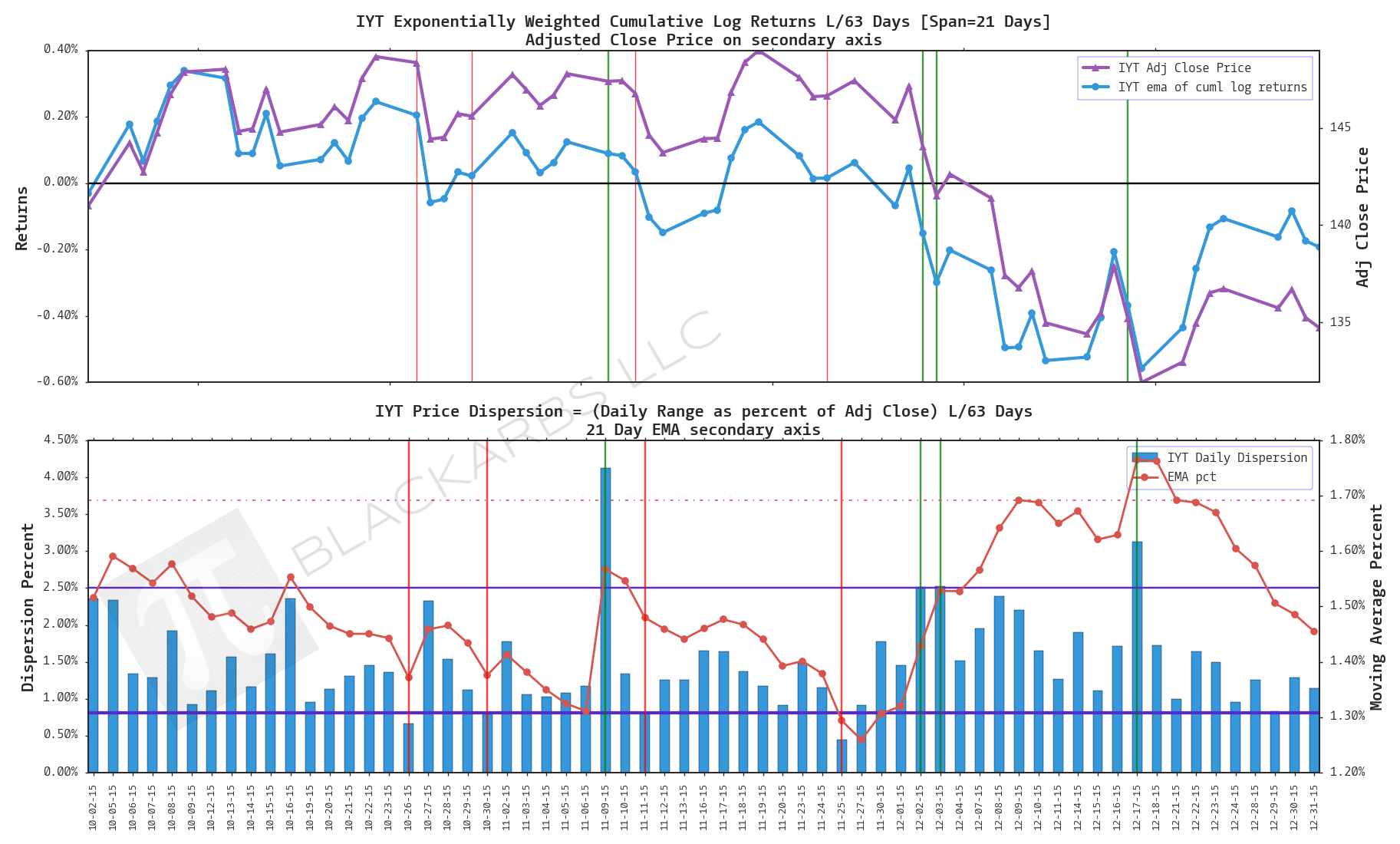
I then used the paper's SKEW measure to sort the equities into deciles. I want to track the performance of some of the highlighted ETF's in the top and bottom deciles in real-time. Here are the resulting names for this week.
ETF SKEW LONGS
XLF
EPI
VOX
XLI
XLP
XLV
HEDJ
IYT
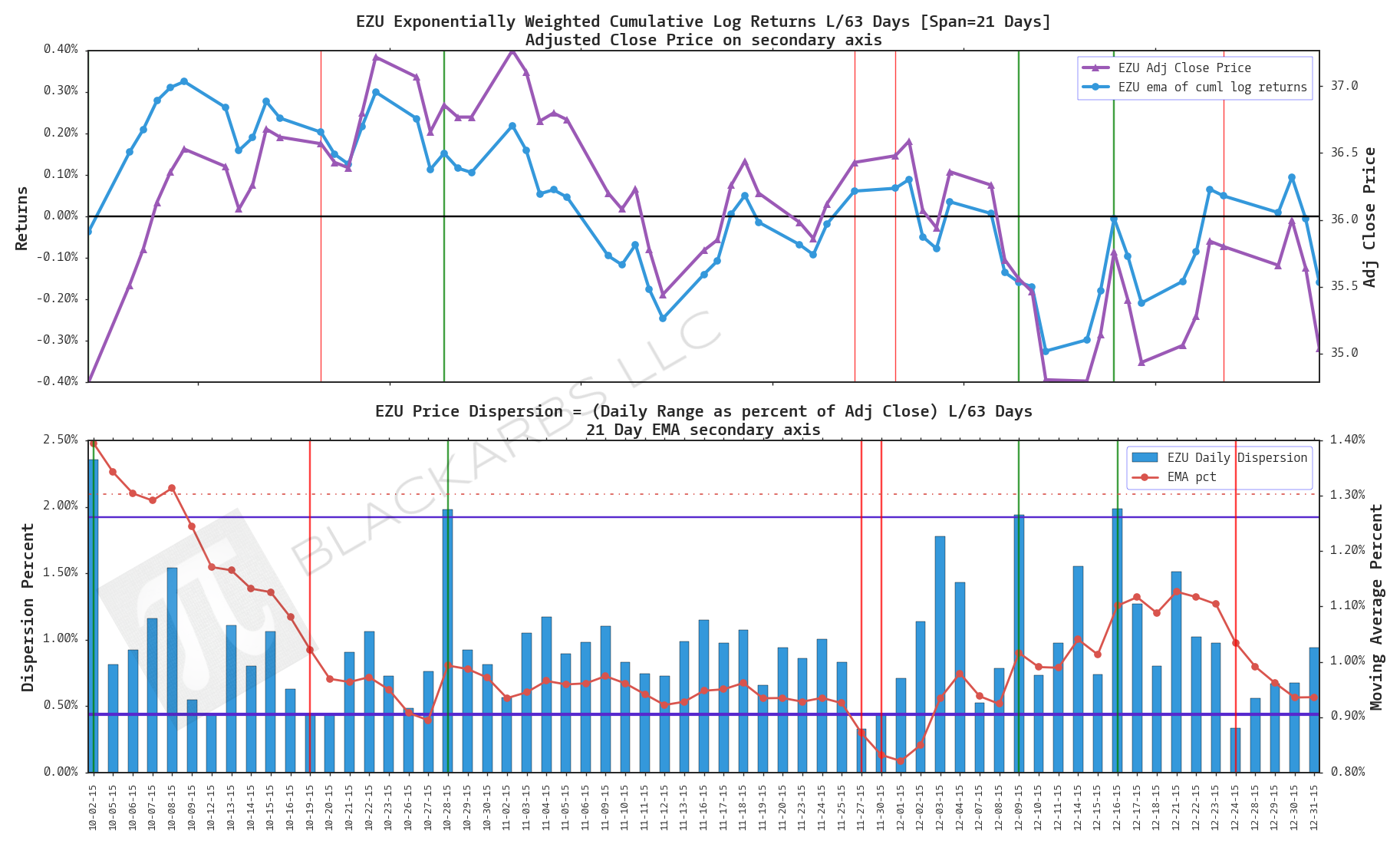
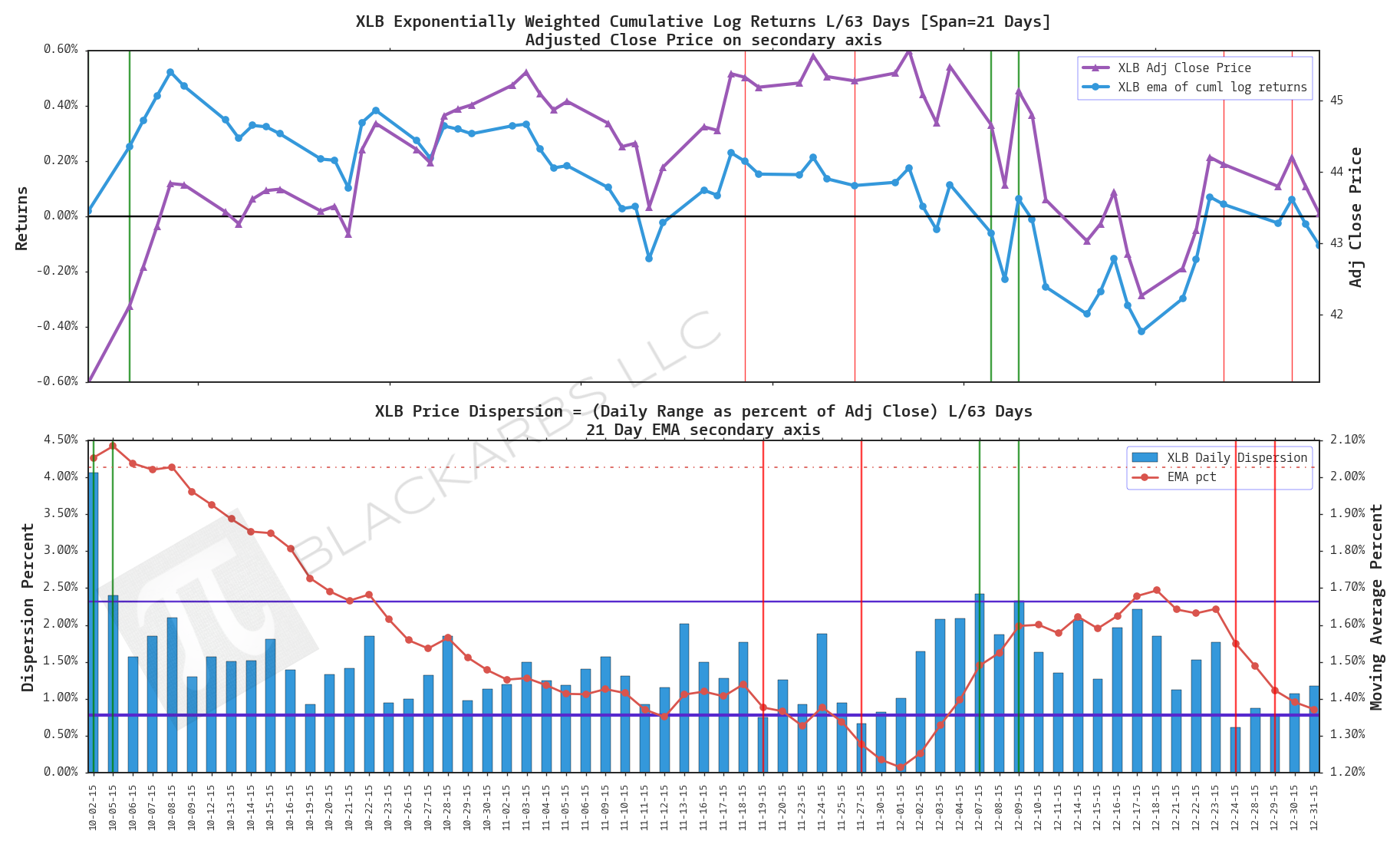
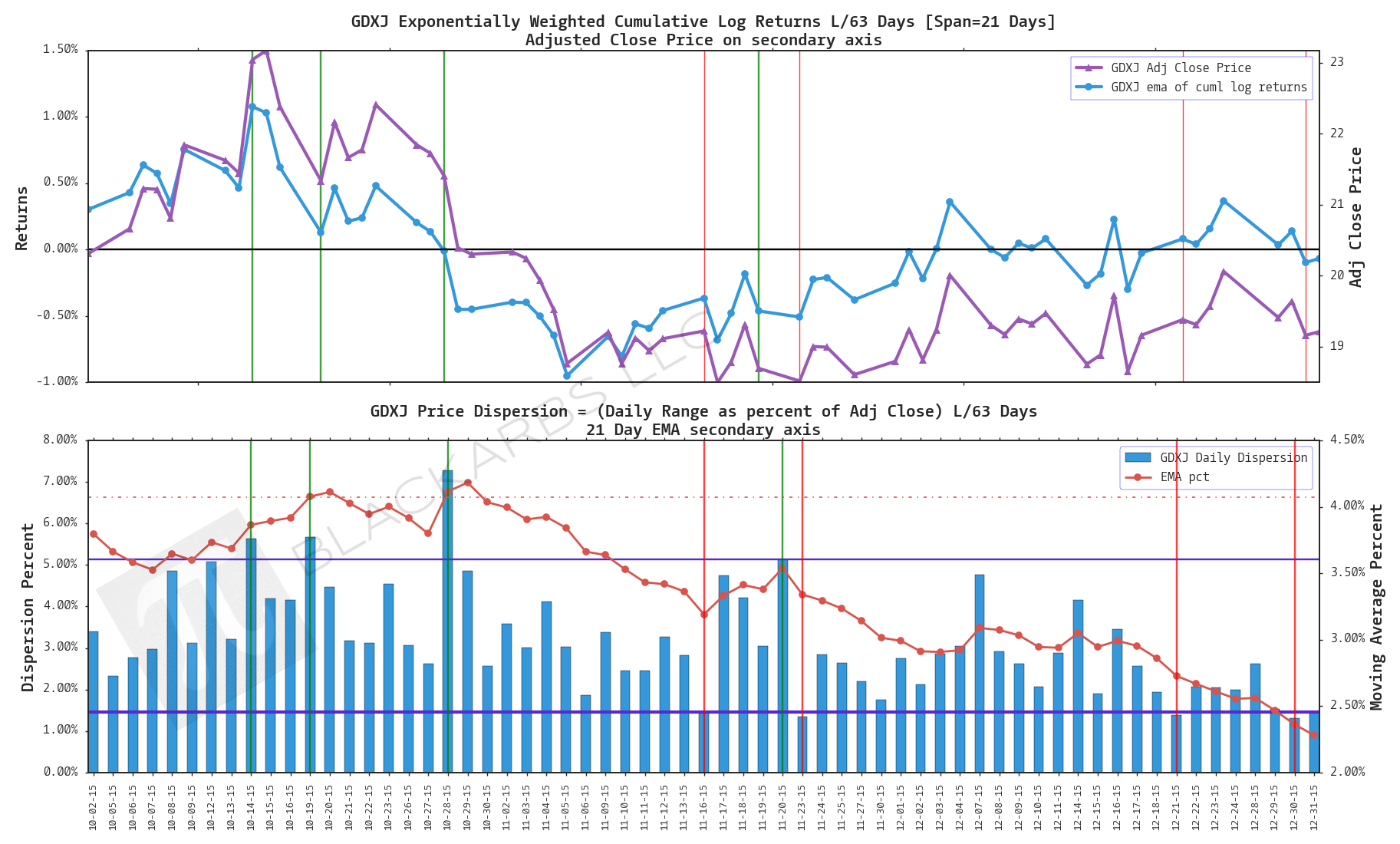
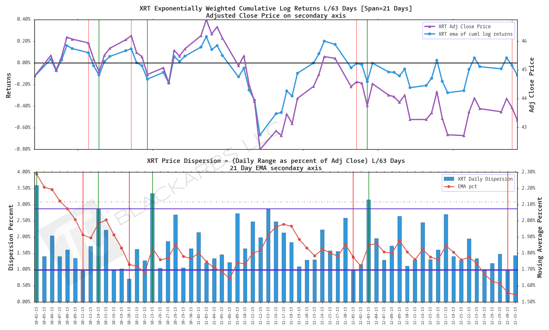
etf skew shorts
EZU
XLB
GDXJ
XRT
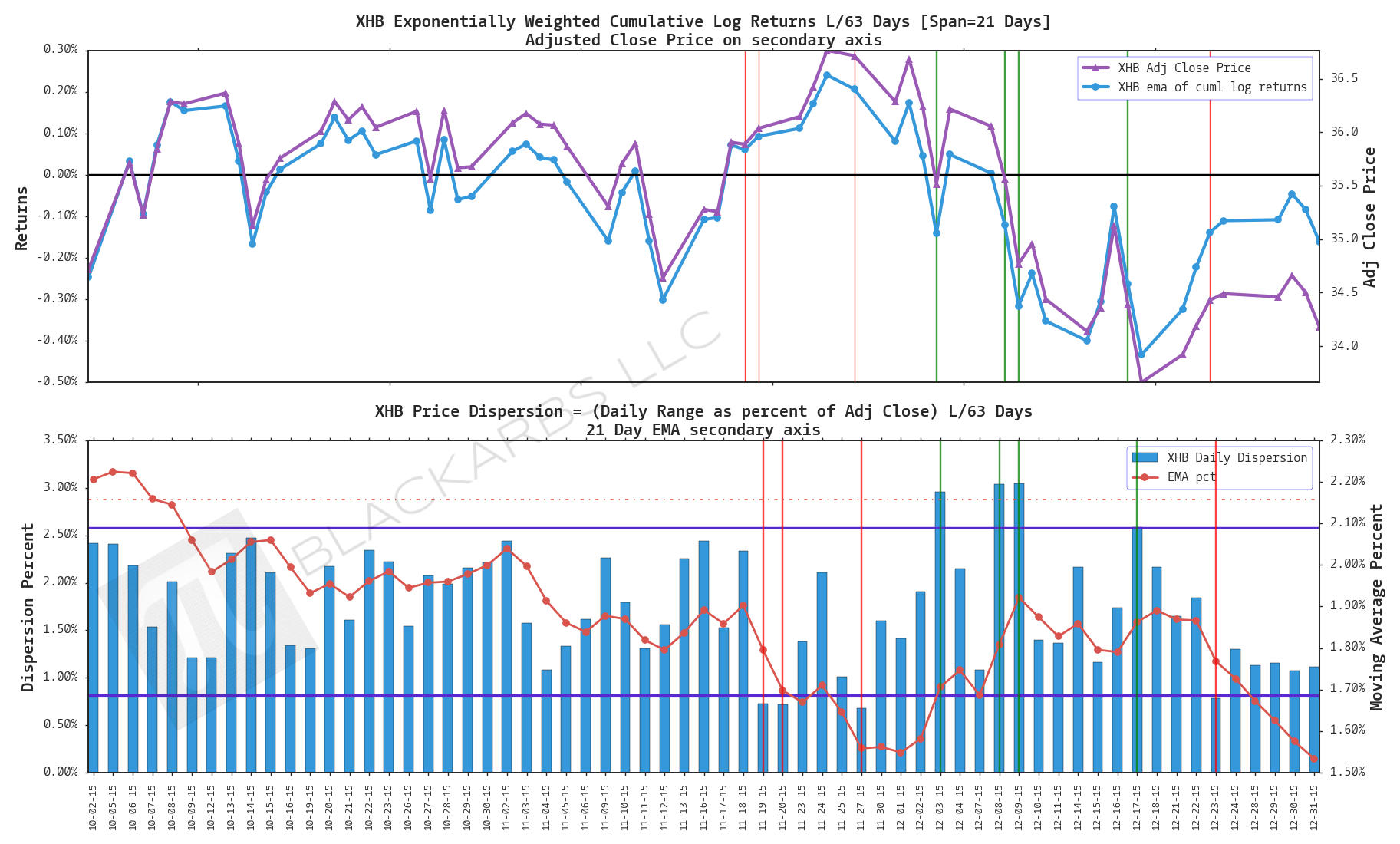
XHB
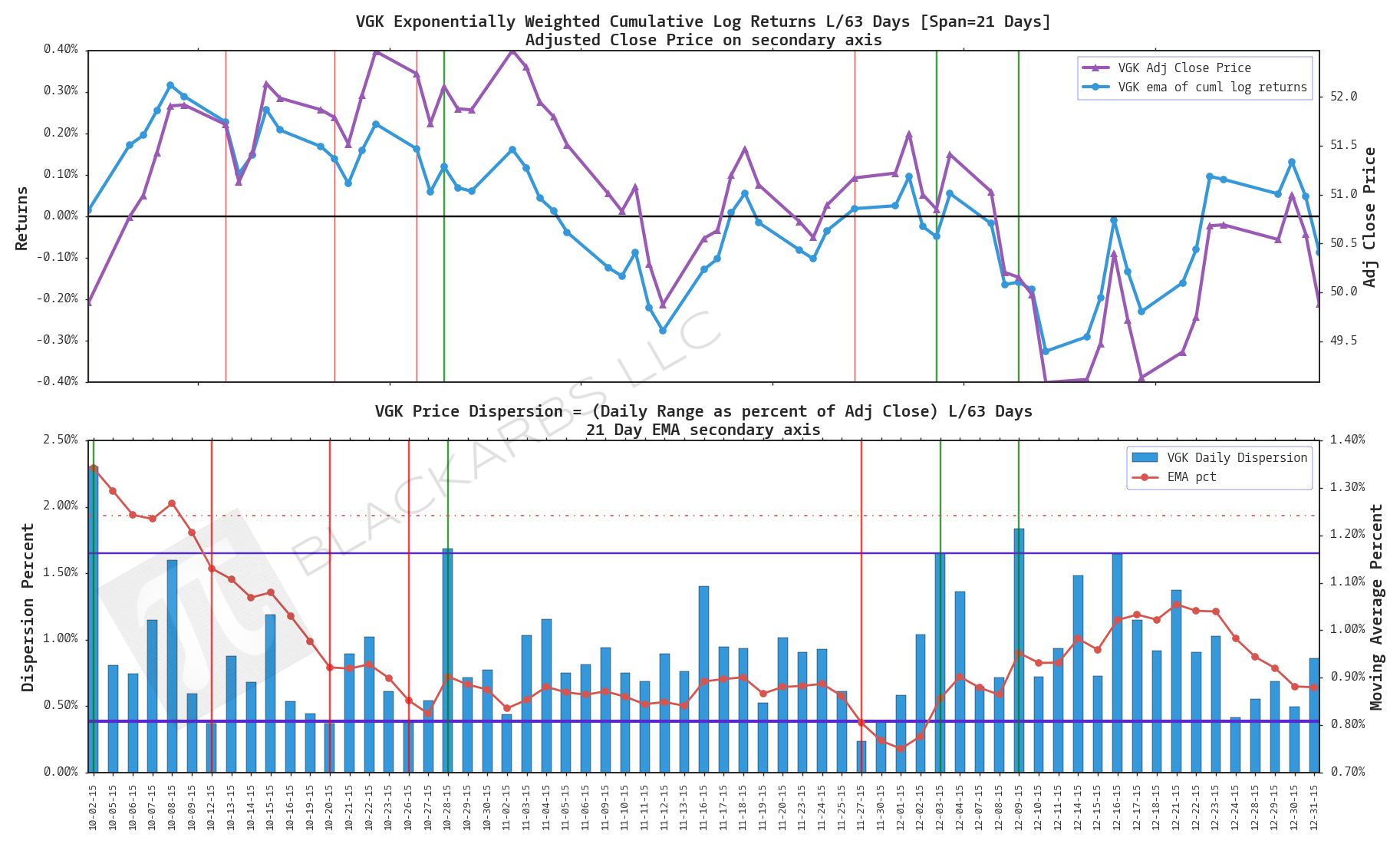
VGK
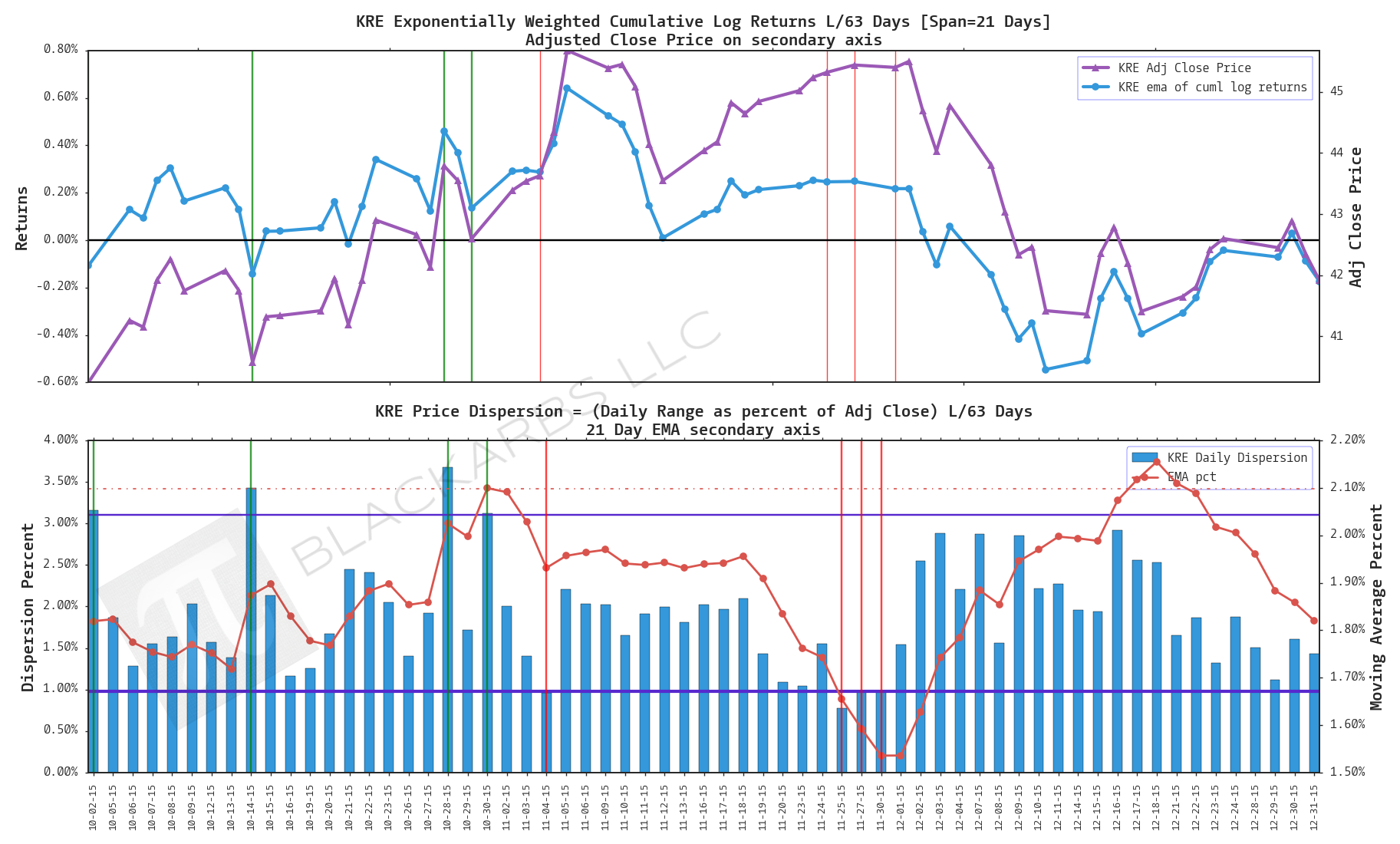
KRE
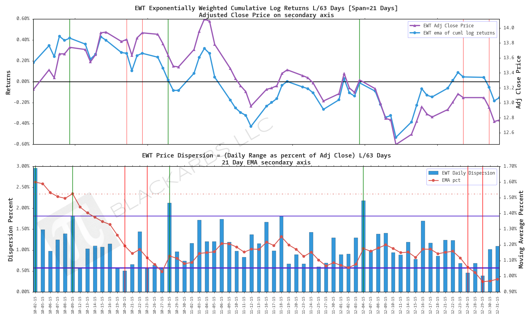
EWT