
How to get Free Intraday Stock Data with Python and BarCharts OnDemand API
/To this day the most popular article I have ever written on this blog was "How to get Free Intraday Stock Data with Netfonds". Unfortunately the Netfonds API has really declined in terms of usability, with too many popular stocks missing, and irregular trade and price quotes. Simply put, as the API went down, so did the code.
However, all hope is not lost. The wonderful people at BarChart.com have created a well documented, easily accessible API for intraday stock data and even near real-time quote access. The only caveat is that you must request access to get a personal API key. Again this is FREE, and the process is extremely simple and straightforward. I think I received my API key within the same day, max 24 hours.
Step 1: Go to http://www.barchartondemand.com/api.php and request an API key.
Step 2: Use or modify my code to get FREE intraday stock data.
Something to note, in this example I use the SP500 components as my list of stock symbols. I covered how to get fresh SPY holdings data directly from the provider in a previous post titled "GET FREE FINANCIAL DATA W/ PYTHON (STATE STREET ETF HOLDINGS - SPY)". Now onto the code...
First I import the necessary modules.
# -*- coding: utf-8 -*-
import time
t0 = time.clock()

import pandas as pd
from pandas.tseries.offsets import BDay
import numpy as np
import datetime as dt
from copy import copy
import warnings
warnings.filterwarnings('ignore',category=pd.io.pytables.PerformanceWarning)
Next I set up what I refer to as a 'datetime management' section of my code. I do this for ALL my time series analysis as a convenient way to standardize my code across projects. Sometimes I only use one of the variables, as I do in this case, but it's so convenient when doing any sort of exploratory analysis with time series. I also do the same for my filepaths.
# ================================================================== #
# datetime management

d = dt.date.today()
# ---------- Days ----------
l10 = d - 10 * BDay()
l21 = d - 21 * BDay()
l63 = d - 63 * BDay()
l252 = d - 252 * BDay()
# ---------- Years ----------
l252_x2 = d - 252 * 2 * BDay()
l252_x3 = d - 252 * 3 * BDay()
l252_x5 = d - 252 * 5 * BDay()
l252_x7 = d - 252 * 7 * BDay()
l252_x10 = d - 252 * 10 * BDay()
l252_x20 = d - 252 * 20 * BDay()
l252_x25 = d - 252 * 25 * BDay()

# ================================================================== #
# filepath management

project_dir = r'D:\\'
price_path = project_dir + r'Stock_Price_Data\\'
Next I set up a convenience function for creating the BarChart url to access the API.
# ================================================================== #
apikey = 'insert_your_api_key'
def construct_barChart_url(sym, start_date, freq, api_key=apikey):
    '''Function to construct barchart api url'''

    url = 'http://marketdata.websol.barchart.com/getHistory.csv?' +\
            'key={}&symbol={}&type={}&startDate={}'.format(api_key, sym, freq, start_date)
    return url
Now for the fun part. I create a function that does the following:
- initializes an empty dictionary and the minimum required API variables,
- iterates through my list of SP500 stocks,
- constructs the proper API url,
- reads the data returned by the db as a csv file conveniently making use of Pandas read_csv function.
- adds the price dataframe to the dictionary dynamically
- converts the python dictionary into a Pandas Panel and returns the Panel
def get_minute_data():
    '''Function to Retrieve <= 3 months of minute data for SP500 components'''

    # This is the required format for datetimes to access the API
    # You could make a function to translate datetime to this format
    start = '20150831000000'
    #end = d
    freq = 'minutes'
    prices = {}
    symbol_count = len(syms)
    N = copy(symbol_count)
    try:
        for i, sym in enumerate(syms, start=1):
            api_url = construct_barChart_url(sym, start, freq, api_key=apikey)
            try:
                csvfile = pd.read_csv(api_url, parse_dates=['timestamp'])
                csvfile.set_index('timestamp', inplace=True)
                prices[sym] = csvfile
            except:
                continue
            N -= 1
            pct_total_left = (N/symbol_count)
            print('{}..[done] | {} of {} symbols collected | percent remaining: {:>.2%}'.format(\
                                                                sym, i, symbol_count, pct_total_left))
    except Exception as e:
        print(e)
    finally:
        pass
    px = pd.Panel.from_dict(prices)

    return px
Now I import our list of stock symbols, make some minor formatting edits and run the code.
# ================================================================== #

# header=3 to skip unnecesary file metadata included by State Street
spy_components = pd.read_excel(project_dir +\
                             '_SPDR_holdings/holdings-spy.xls', header=3)
syms = spy_components.Identifier.dropna()
syms = syms.drop(syms.index[-1]).order()

pxx = get_minute_data()
This script takes roughly 40 minutes to run, longer if you try to get the full 3 months they provide, less if you need less data.
Now let's test our output to make sure we got what we expected.
print(pxx)
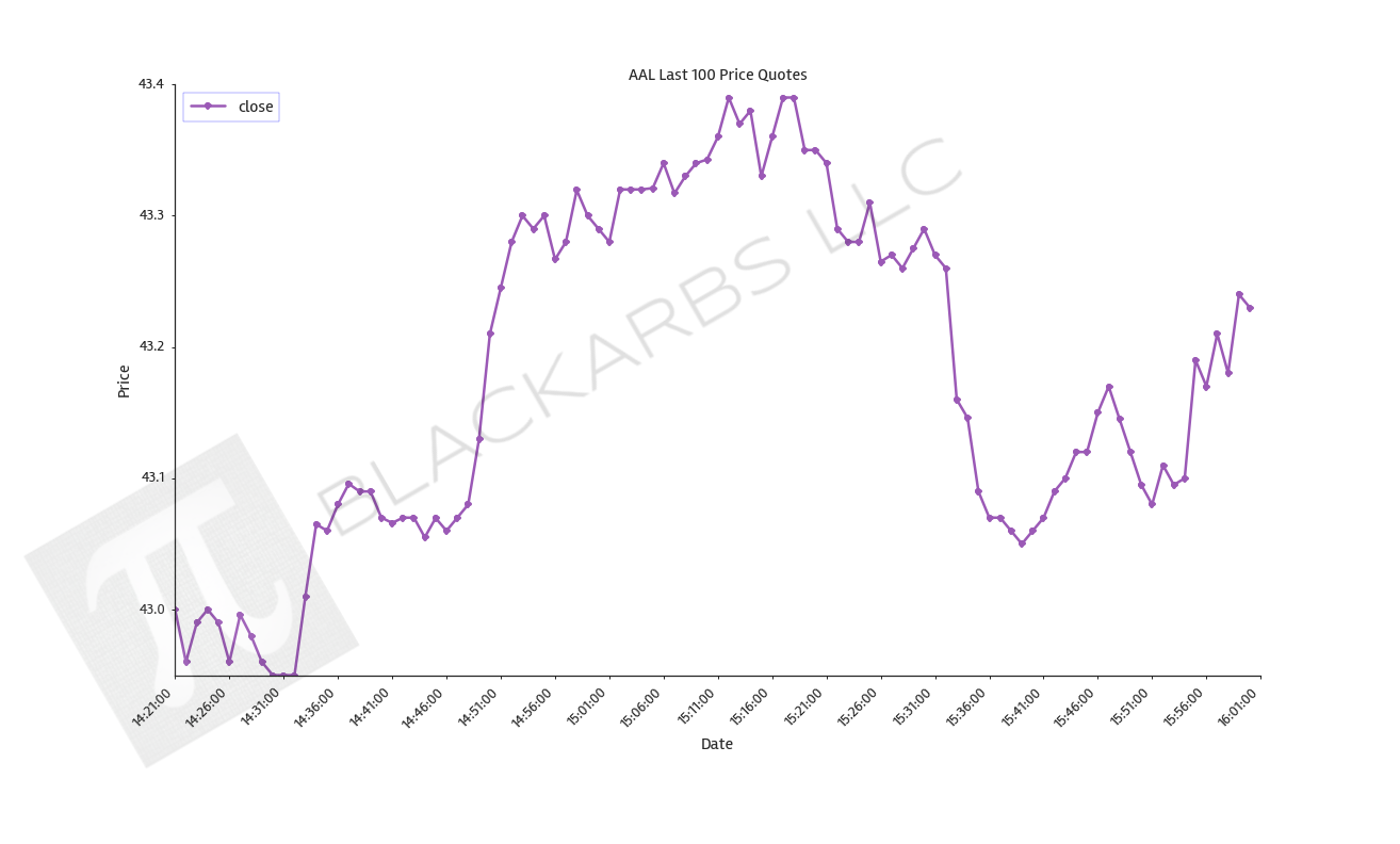
print(pxx['AAL'].tail())
print(pxx['ZTS'].tail())
The code ran correctly it appears, and the output is what we expected. One thing you may have noticed is that time stamps are not 'EST'. If you want to convert them use the following one liner.
# convert timestamps to EST
pxx.major_axis = pxx.major_axis.tz_localize('utc').tz_convert('US/Eastern')
There is one last consideration that is easy to overlook if you're unfamiliar with some of the technical challenges of 'big data'. When you first run a script like this it is tempting to use the usual storage techniques that pandas provides such as 'pd.to_csv()' or 'pd.to_excel()'. However, consider the volume of data we just collected: 502 (items) x 5866 (major_axis) x 7 (minor_axis) = 20,613,124.
Look at it again and consider this simple code collected over 20 million data points! I ran into trouble with Python/Excel I/O with only 3.5 million data points in the past. Meaning importing and exporting the data took minutes. That's a serious hangup for any type of exploratory research, especially if you plan on sharing and/or collaborating using this dataset.
Pandas HDF5 file storage format to the rescue! Feel free to investigate the power, speed and scalability of HDF5 via the Pandas docs or any of the numerous quality blogs out there accessible by a google search. Needless to say, I/O was reduced from several minutes both ways to seconds. Here is the code I used to store the panel.
try:
    store = pd.HDFStore(price_path + 'Minute_Symbol_Data.h5')
    store['minute_prices'] = pxx
    store.close()
except Exception as e:
    print(e)
finally:
    pass
Here's a sample plot with the intraday data.
The entire code is posted below using Gist.